Sherwin-Williams Agreeable Gray: Paint Color Review
Table of Contents
Sherwin-Williams Agreeable Gray: Paint Color Review
Sherwin-Williams Agreeable Gray is a favorite paint color known for its flexibility. It’s a mix of beige and gray, making it perfect for many spaces. This color has a light reflectance value (LRV) of 60, which means it’s bright but not too light.
It’s been a top pick for years, even though it’s not strictly gray. Its unique blend of beige and gray makes it appealing to many. Homeowners and designers love it for its versatility.
Key Takeaways
- Sherwin-Williams Agreeable Gray is a hugely popular greige-taupe/warm gray paint color
- It has a light reflectance value (LRV) of 60, making it a bright, versatile neutral
- Agreeable Gray is known for its ability to seamlessly blend beige and gray undertones
- The color has maintained its status as a top choice among homeowners and designers for years
- Agreeable Gray is recommended for a variety of interior spaces, from living areas to kitchens
Understanding Agreeable Gray: A Versatile Neutral
Sherwin-Williams Agreeable Gray (SW 7029) is a favorite among homeowners and designers. This calming hue is a soft shade that fits many interior styles. It’s perfect for those who want a tranquil color palette.
What Makes It So Popular
Agreeable Gray is loved for being a neutral background. It’s ideal for those who don’t want to go all the way to beige. It leans towards gray but keeps things warm. Its neutral undertones make it versatile for many spaces.
Key Features and Characteristics
- Agreeable Gray is a greige-taupe hybrid that looks like a warm gray.
- It’s more gray than beige but not fully gray. This makes it versatile for different designs.
- Agreeable Gray has an LRV of 60. This makes it good for adding brightness to a room.
- The RGB values for Agreeable Gray are R: 209, G: 203, B: 193, with a Hex Code of #D1CBC1.
Paint Color Classification
Agreeable Gray is a greige-taupe hybrid. It mixes beige’s warmth with gray’s coolness. This balance makes it fit many styles, from traditional to modern, without being too bold.

Light Reflectance Value (LRV) and Brightness
The Light Reflectance Value (LRV) is key when picking paint colors. LRV shows how light or dark a color is, from 0 (black) to 100 (white). Sherwin-Williams’ Agreeable Gray has an LRV of 60, making it light to medium.
Agreeable Gray’s LRV of 60 means it reflects a lot of light. This makes it a versatile neutral that’s not too bright or too dark. It looks good with white trim and keeps rooms feeling light and airy.
The LRV of a paint color greatly affects a room’s brightness and feel. Colors with high LRV, like pure white, make rooms feel brighter and bigger. Colors with low LRV, like near-black Black Magic, create a cozy and intimate feel.
Knowing the LRV of Agreeable Gray helps you choose the right color for your space. It also helps you pick the best trim and accent colors. This ensures your space looks exactly how you want it to.
Undertones and Color Properties
Agreeable Gray is a versatile and sophisticated paint color. It balances the nuances of beige and gray perfectly. This color isn’t strongly tied to any undertone, making it easy to fit into any setting.
Depending on where it’s used, Agreeable Gray can pick up hints of green, violet, or blue. These subtle touches add depth and character to the space.
Beige and Gray Balance
Agreeable Gray is a greige color, blending gray and beige. It has warm undertones that make a space cozy and inviting. At the same time, its cool undertones keep things refined and balanced.
This balance is why Agreeable Gray is a sophisticated nuances and balanced undertones choice. It fits well with many design styles.
How Light Affects the Color
The look of Agreeable Gray changes with the light in a room. In south-facing spaces, it looks warmer and more beige-like. In north-facing rooms, it appears cooler and grayer.
Natural and artificial lighting can also change how we see the color. This happens throughout the day and across the seasons.
Seasonal Color Changes
- In winter, Agreeable Gray takes on a cooler, more muted look. It fits well with the natural tones of the season.
- As spring and summer arrive, the color brightens and becomes more vibrant. It matches the warmer, lighter feel of these seasons.
Agreeable Gray’s versatility makes it a timeless choice for any space. It allows you to create a design that looks good all year round, no matter the season or lighting.

Room Orientation and Lighting Effects
Agreeable Gray by Sherwin-Williams looks different in various rooms. Its neutral color works well in many settings, adding calmness. It fits well with many design styles.
In north-facing rooms, Agreeable Gray looks cooler. South-facing rooms make it warmer. East-facing rooms might make it seem cooler, while west-facing rooms can change its look throughout the day.
This color’s flexibility makes it very popular. It helps create a unified look in any room, no matter the lighting. Knowing how it reacts to light helps you choose the right shade for your home.

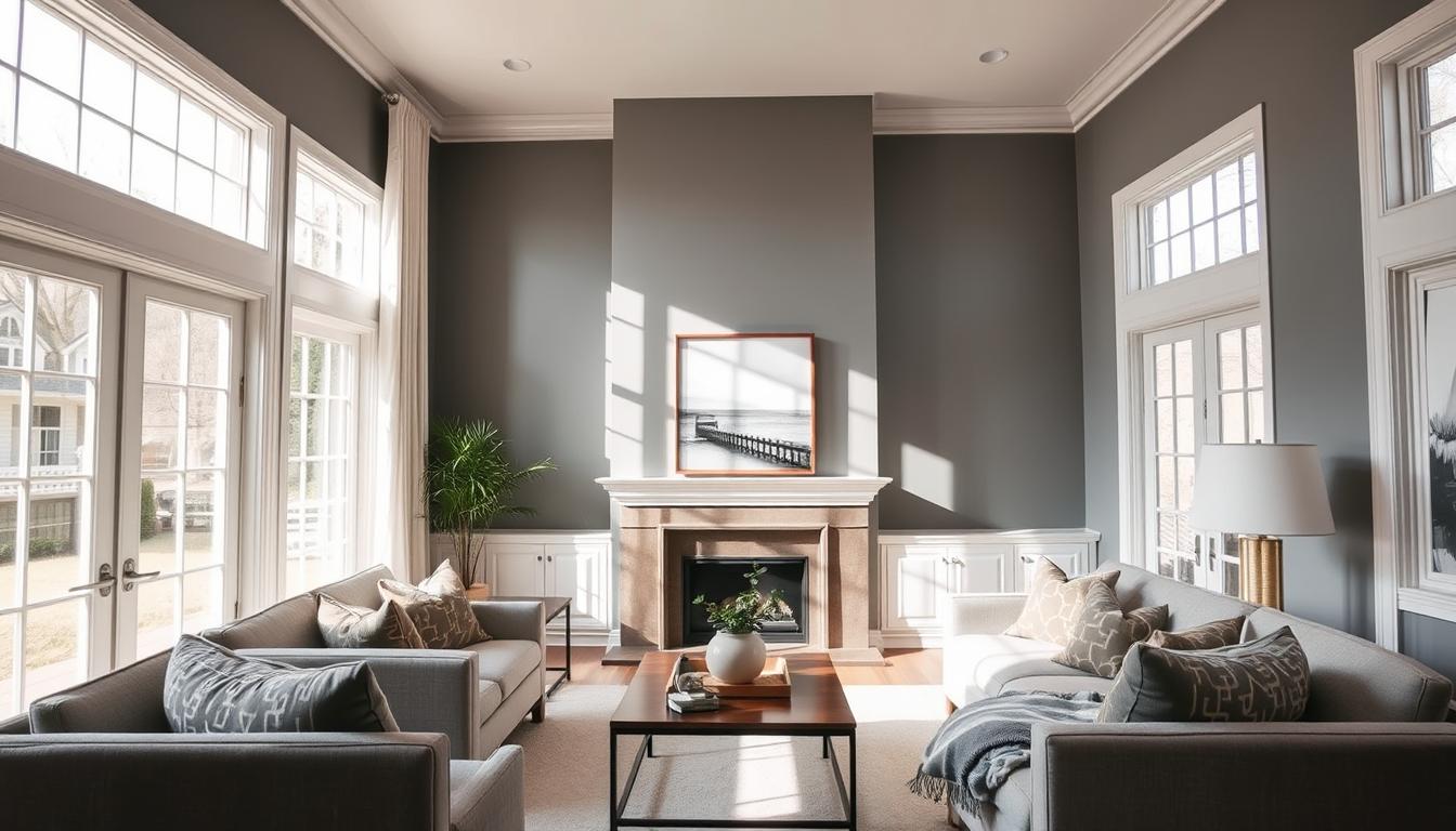
Best Rooms for Agreeable Gray
Sherwin-Williams Agreeable Gray is a versatile neutral paint color. It can enhance various spaces in your home. From calm living areas to cozy bedrooms, it offers a perfect balance of warmth and depth.
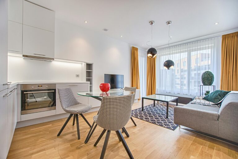
Living Spaces and Common Areas
Agreeable Gray is great for open-concept living spaces. It creates a cohesive and inviting atmosphere. Its versatile tints complement a wide range of furnishings and decor.
It’s perfect for living rooms, dining rooms, and entryways. The color’s calming presence makes it ideal for entertaining or relaxing.
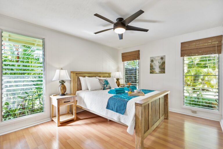
Bedrooms and Private Spaces
The tranquil colors of Agreeable Gray are popular for bedrooms and private areas. Its soothing undertones foster a sense of serenity and relaxation. It’s perfect for creating a peaceful retreat.
Whether updating your master suite or a cozy guest room, this neutral hue is a sophisticated choice. It provides a calming canvas for your personal sanctuary.
Kitchen and Dining Areas
In kitchens and dining spaces, Agreeable Gray works well. Its warm undertones complement various cabinetry and countertop finishes. It creates a cohesive and inviting atmosphere.
The versatility of Agreeable Gray allows it to seamlessly transition between the kitchen and dining areas. It unifies the overall design.

Coordinating Colors and Design Schemes
Sherwin-Williams Agreeable Gray is a versatile paint color. It pairs well with many hues, making your interior design sophisticated. This neutral color works with whites, blues, neutrals, and wood tones.
Agreeable Gray is great for any design scheme. It fits modern, minimalist styles or cozy, traditional ones. Its subtle sophisticated nuances make it perfect for various interior styles, from farmhouse to contemporary.
Complementary Color Pairings
Agreeable Gray’s neutral palette makes it easy to match with other colors. Try pairing it with:
- Crisp, clean whites for a classic, timeless look
- Deep, moody blues or greens to create a statement-making contrast
- Warm neutrals like beige, cream, or taupe for a cozy, inviting ambiance
- Rich wood tones in furniture and accessories for a natural, organic feel
There are endless ways to coordinate Agreeable Gray with your design. By choosing the right colors, textures, and finishes, you can create a space that shows off your style.
Trim and Accent Color Pairings
Choosing the right trim and accent colors with Sherwin-Williams’ Agreeable Gray paint is key. This neutral shade looks great with many colors. It helps create a space that’s both harmonious and visually appealing.
White Trim Options
Pure white trim is a classic choice with Agreeable Gray. Sherwin-Williams’ Pure White is a favorite for its crisp contrast. Alabaster and Extra White also work well, offering different undertones that complement Agreeable Gray’s balanced look.
Complementary Paint Colors
Agreeable Gray can be paired with many colors to add depth. Deep blues, greens, and dark grays create a striking contrast. Warm neutrals and earthy tones bring a cozy feel. Consider Comfort Gray, Privilege Green, Guilford Green, Naval, Rainwashed, Palladian Blue, and Urbane Bronze for a great look.
How to Sample Agreeable Gray Effectively
Choosing the right paint color is crucial. Sherwin-Williams’ Agreeable Gray is a versatile neutral that suits many spaces. But, it’s vital to test it well before making a final choice. Use large peel-and-stick paint samples like Samplize to get a true feel of this soft, muted tone.
These big 9″x14″ samples let you move the color around and see how it looks in different lights. Spend time testing Agreeable Gray at various times and under different lights. Living with the samples for a few days helps you make a better choice before painting a whole wall or room.
To get the best results, place the samples vertically. This way, you see how light reflects off them accurately. Also, check the color in shaded areas and natural light to understand its undertones and how it changes.
If you need to tweak the color, paint stores usually offer adjustments in 25%, 50%, or 75% increments. When making samples, apply two coats of paint. Leave white space around the sample for better color perception. Use roller brushes for painting and avoid foam rollers for better coverage.
Painting samples on a smooth surface like poster board is best for accurate color. While digital images and swatches give a general idea, testing Agreeable Gray in your space is key. It ensures it’s the perfect soft, muted tone for your design.
Conclusion
Sherwin-Williams Agreeable Gray is a favorite for many. It works well in different lighting and styles. This makes it a top choice for both homeowners and designers.
Its balanced and warm nature keeps it popular. Trends may change, but Agreeable Gray stays the same. It’s a classic in interior design.
The agreeable gray paint color is known for its versatile tints. It can change any space, making it a timeless choice. Its soft tones and ability to create calm spaces are loved by many.
When looking for the right paint color, think of Sherwin-Williams Agreeable Gray. It’s adaptable and adds warmth to any room. Let Agreeable Gray be the base of your dream home.